VR Studio Art Classes
Out team was tasked by A. LYNN to lower their sites bounce rate and try to find a way to increase the sites conversion rate from visitors on their responsive website. We helped them take a new approach to their layout and value proposition. Check it out!

RESPONSIVE WEB
We were tasked by A. LYNN to lower their sites bounce rate and try to find a way to increase the sites conversion rate from visitors on their responsive website. We helped them take a new approach to their layout and value proposition. Check it out!
RESPONSIVE WEB
We were tasked by A. LYNN to lower their sites bounce rate and try to find a way to increase the sites conversion rate from visitors on their responsive website. We helped them take a new approach to their layout and value proposition. Check it out!
Nordstrom Rack E-Commerce Redesign Case Study
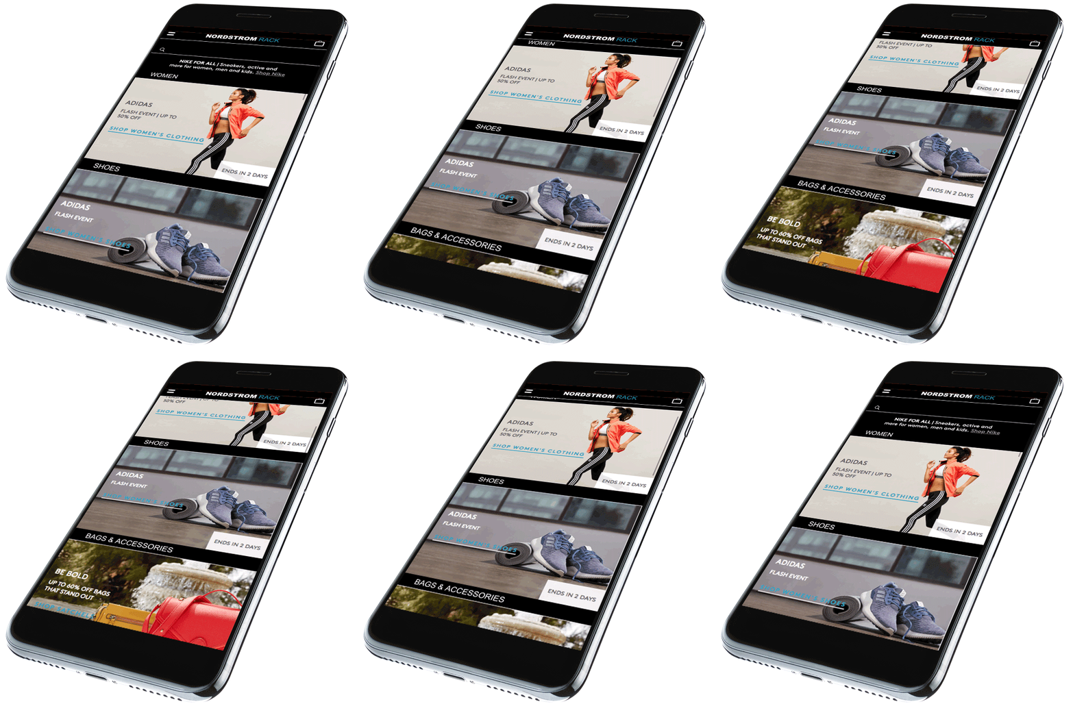
We were tasked to redesign the Nordstrom Rack website. Nordstrom Rack is a fashion retailer based in the United States which is owned by Nordstrom and has both brick and mortar stores and an E-commerce website. Nordstrom Rack offers branded clothing and accessories for women, men, and kids at a large discount to consumers across the United States.

Team
David Sainté
Natasha Jahchan
Danielle Francois
Kevin Regan
ROLES
UX RESEARCHER
UX/UI DESIGNER
TIME
2 Weeks
Research
Our team performed a heuristic analysis to test the sites functionality before sending out surveys to find the main demographic of user to test the site. During the analysis the site seemed to function pretty well with a few exceptions and that was after each member of the team individually ran their own analysis. Filters in catalog are a bit unclear. Specifically, discerning which filters are turned on is difficult. There is no way to save favorites. Breadcrumbs do not appear on pages navigated to by search. If the user goes in the cart there is no way except the browser back button to return to the section of the catalog
last browsed.
We conducted a survey to find the target audience that would typically shop at Nordstrom Rack. Our user usually know what they are looking for when shopping online. All users filter the items their shopping for by price, characteristics (color, material, etc.), brand, sale/clearance, or size.

70% of our user base
shops mostly online

90% of users are primarily looking for the best price or the best product when shopping online.

All users sort the items their shopping for by price, color, material, etc.
Usability testing on the site confirmed what we observed in our heuristic analysis. Filtering on states are not legible enough. It’s not clear when they are turned on. Usability test subjects also found the site to be functional but bland. They said it is a site they would go to for a specific item but not to shop.

"It was good, nothing troublesome. Only thing was clicking on filter instead of "view all clearance"
"The entire sight is very bland, so everything generally
fades into the background."
"It's not visually appealing. It wasn't straight forward and clear."
We performed a Competitive Matrix to find what companies were competition and a comparator with the same user base and business model of Nordstrom Rack. Then we did a business and feature analysis of each company to compare their successes, layout and potential solutions for heuristic.
Feature Analysis

We created a site map, task and user flow charts of the current site then performed a digital card sort of the current site and this comfirmed Nordstrom Rack’s existing architecture.
Synthesis
The Nordstrom Rack site’s layout on both desktop and mobile follows conventional design patterns for clothing e-commerce sites. Usability testing on the site confirmed what we observed in our heuristic analysis. Filtering on states are not legible enough. It’s not clear when they are turned on. Also, our usability test participants found the site to be functional but bland. They said it is a site they would go to for a specific item but not to shop. Usability testing and feature analysis also reinforced our findings from heuristics with the original site lacking a favoriting feature and Breadcrumbs.
THE OPPORTUNITY
The site did not delight. Users found the site to be functional but bland
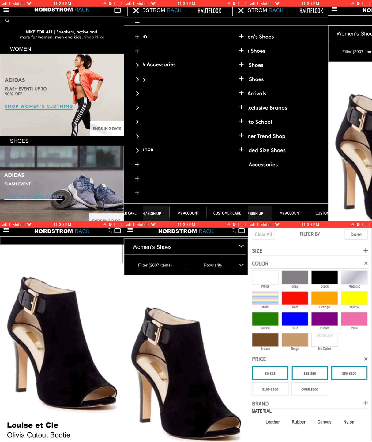
Filtering states are not legible when they are turned on
the original site lacks a favoriting feature and clear breadcrumbs
PROBLEM STATEMENT
Susan does not like looking at the Nordstrom Rack website while searching for items and wishes the filter system was a little more specific with material.
How can we help make her browsing experience on the site more pleasurable and make sorting through filter aspect more refined when searching for items?
Our Prototype
Our previous usability test was performed on both mobile and desktop because we were redesigning a responsive website. Although I created layouts for both platforms, I focused my prototype for the mobile platform. Once the prototype was created we performed usability testing for two rounds with iterations being performed between the two.
Desktop Example
after completing the research for this case study I also decided to take a very minimal approach to the redesign of this new responsive site. Looking to find more by simply removing to many options.
Preposed home screen
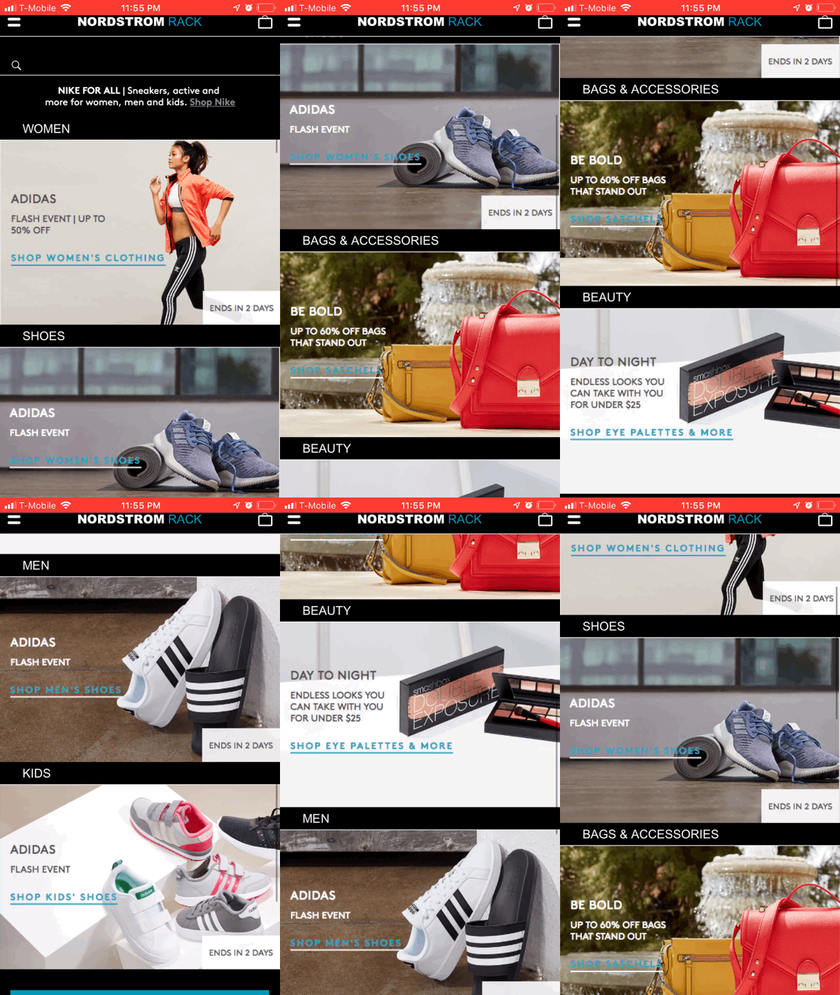
Original home screen

Mobile Mockup
Our new design takes on a more dark and sleek look based on what the high end competitor standards to give our users a little more delight while interacting with our application. There weren't any changes made on the original site map. The key issues we found in the research faze that stood out, were with the filtering system.


Home Page


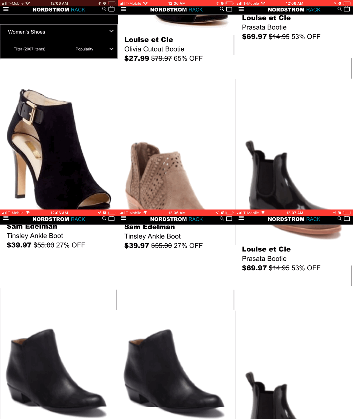
Product Page

